JUDGE DREDD MEGAZINE #342 | REVIEW

20131129_194629

In this months Meg, a lot of the running stories will conclude with new ones waiting to take their places for the Christmas edition. And just like the past few months, this month we also have another excellent Meg on our hands.

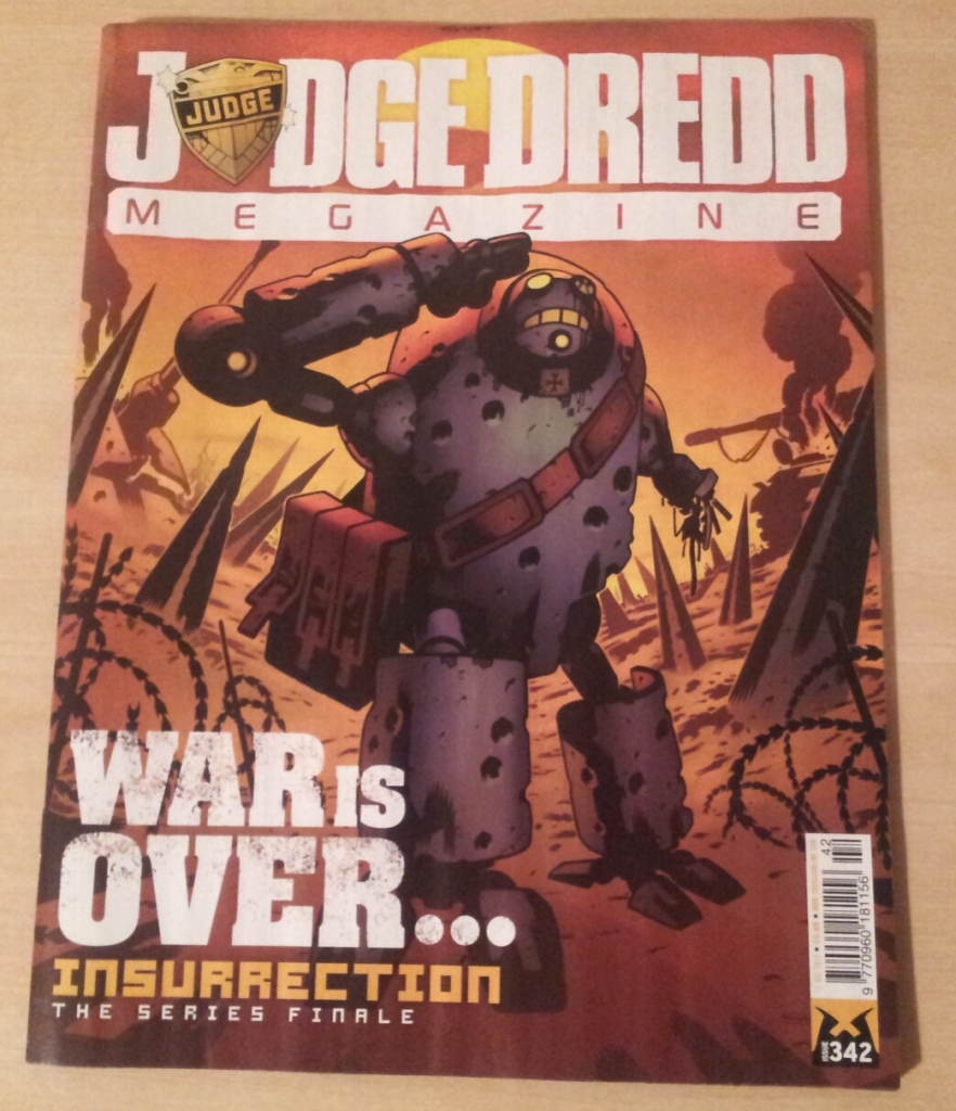
Let me begin with the cover; I always look forward to Colin MacNeil’s covers but this right here is simply jawdroppingly, saliva droolingly magnificent. With the deep sepia toned background (with a ‘magic hour’ vibe to it), and the droid, bullet ridden but still standing in salute to a character off cover, it is at once a beautiful and sombre work. And quite possibly one of my favourite of the year.

We begin with Judge Dredd: Duty Calls, by Alec Worley and Ben Willsher. I have to say that I am on the fence regarding Willsher’s art, I do not find it appealing yet do not dislike it either. One of my issues is with the inability to discern what is going on a lot of the time, no doubt it’s very visceral but the rough scratchy style just isn’t my cup of tea. Having said that, I did enjoy the story which revolves around Judge Dredd and a fellow Judge (Garrick) being holed up in a war ravaged area under attack from a rogue Judge, who looks like a cross between the Green Goblin and the Silver Surfer, taking pot shots at them from his Powerboard. It’s a nice little tale, with a brilliant last panel showing the sacrifice made by all those who died upholding the law. There’s also a nod to some past Doctor Who’s in one panel (what with it being the show’s 50th Anniversary and what not) which I thought was pretty cool.

We then have an Interrogation with artist Will Simpson, which I enjoyed reading. I normally read the interviews/ features after finishing the strips, and this was another really informative and interesting piece by Mike Molcher looking into Mr. Simpson’s upbringing and work through the years. I can’t say I’m familar with it (his work) , but what it does do is give me the desire to go and seek it out. He seems like a lovely bloke by the way!

Insurrection III (Part Nine) is up next and I must say I was trying my damnest not to choke up. It was a beautiful and heartbreaking finalé to a magnificent series. I have read the second and now this, the last series, and I can comfortably say that it has been one of the best stories in the Meg during the last few years. I am saddened to see it end, but Dan Abnett gives it a memorable sendoff. I had come to grow fond of the characters, from Simeon, Freely and Luther to all the droids and mutants which made up the Liberty brotherhood.

One thing I noticed during my reading of this series and the last one, is that we do not see the enemy, the Zhinds, face to face other then a shot of an arm (like here) or two. I wonder if that was that a conscious decision by Abnett and MacNeil? Nevertheless, I feel it works really well. Afterall, the real story is about the Insurrectionists and their persuers, and the characters on both sides.

Colin MacNeil’s art is simply stunning, from the opening panel (where we see the title at the start rather than the end), to those quiet moments between Simeon and Freely which nearly brought a tear to my eye, and the closing moments with the hooded figure who relates the story. It’s superb work indeed.

I will really miss this strip. I hope when we see it collected in a trade, we see the entire series in one book; how about a hardcover like Trifecta? That would be perfect. But for now all I can say is thank you Dan, Colin et al, for a marvellous, memorable story.

Ordinary (Part Three) follows soon after, and we have another mindbogglingly mad (not to mention delightful) episode! Our hero Richmond Cle…er, I mean Michael Fisher still carries on with his quest to locate his son, while the world around him goes bonkers. From those in high places, to those on the streets, nobody has a clue what is going on with everyone exhibiting his/ her own extraordinary powers except for poor old Michael. But as is demonstrated with his encounter with a human bomb, not everyone has it easy. This is another fun packed episode from Rob Williams, and some lovely art from D’Israeli. I’m looking forward to seeing how the story developes next month.

Next up, another Interrogation, this time with Warwick Johnson Cadwell. I really enjoyed reading it, although slightly shorter than the first interview. There’s some lovely art on display from Cadwell, and I’d love to seek some of it out. Well done to Matthew Badham and Mike Molcher for two really enjoyable Interrogations!

Finally, Dredd: Underbelly (Part Three). I must say I was really disappointed with this concluding episode. There are some excellent panels on display by Henry Flint, not least that double page splash of the block interior (it reminded me of Minority Report’s Spyder scene), but Arthur Wyatt’s script for this episode was so….uninspiring. I mean it started off pretty well, I enjoyed Part One and Two, but was not overly bowled over by it. As soon as I thought things would get interesting, it bloody ends. That’s the problem, the story felt too brief, not to mention no way near as exciting or thrilling as the movie. In fact, if this was a live-action sequel, it would probably be a really poor one. I mean sequels….they’re rarely good. Hopefully the threequel (if there is one) will fare much better.

So a pretty strong Meg overall. Ordinary and Insurrection were the standout for me. It’ll be interesting to see some of the new line ups next issue, and I’m looking forward to it too!

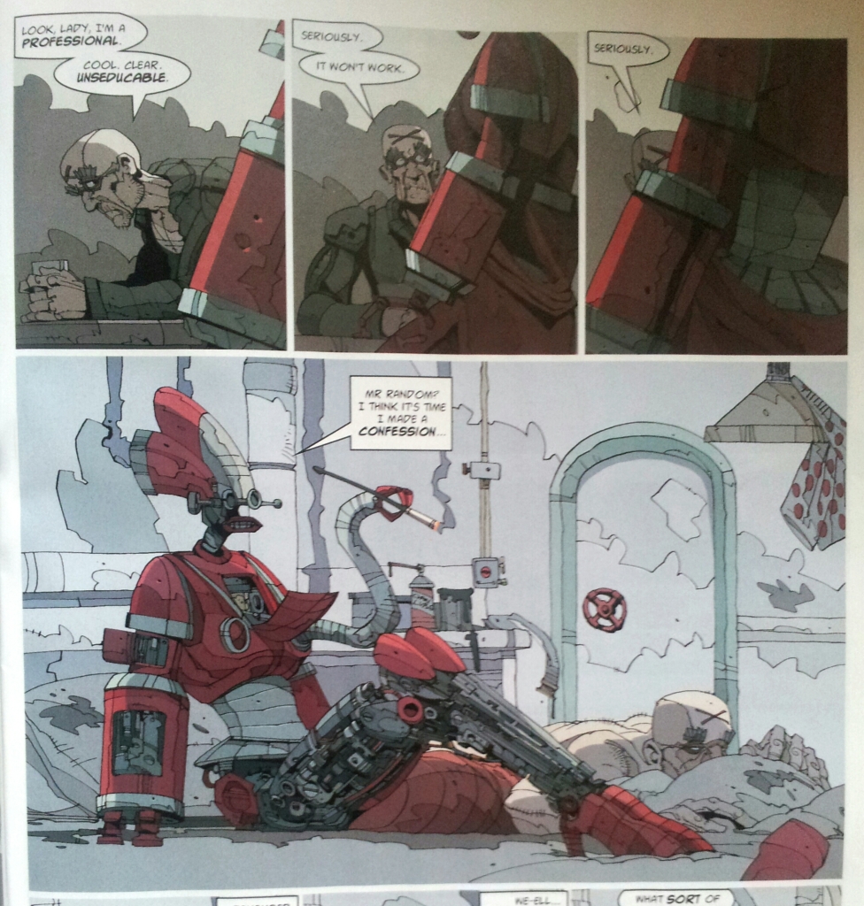
Before I finish, a small word on the floppy – Lobster Random; I fragging loved it! This is some trade quality stuff, I’m surprised to see it in the floppy. I’m not a big fan of Spurrier’s work, but his creation of Lobster Random is inspirational stuff! The story was laugh out loud funny, with some eye popping artwork by Carl Critchlow. I say it again, how on earth was this not in a trade?!! It boggles the mind!
20131128_1316441
The extra Future Shock stories at the end were also a blast, not least ‘Big Red’, with its futuristic take on Moby Dick!

Judge Dredd Megazine: 4/5
Lobster Randon: Tooth & Claws: 5/5
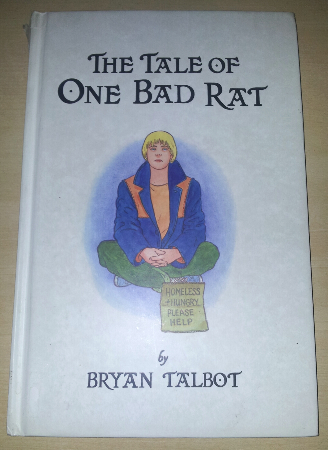
THE TALE OF ONE BAD RAT | REVIEW

THE TALE OF ONE BAD RAT | REVIEW

Bryan Talbot’s The Tale of one Bad Rat is one of the most powerful graphic novel I have read.

At once, tragic and heart-breaking and yet uplifting too. The story is about Helen Potter, who as a child suffered sexual abuse from her father. She runs away from home, first to London where she takes up begging to survive, before meeting a young Geordie lad who has dreams of starting his own band. Due to tragic circumstances she then moves to the Lake District where she meets a lovely couple who take her in, giving her a job. But all this time she funds it difficult to deal with everything as memory of her abuse is so strong. Like most abuse victims she blames herself, but questions why she does so. One of the most powerful moments is when she confronts her father about the abuse, it just shows him for the coward that he is. And in a way, it can give her much needed closure so she can move on with her life. The final moments of her sitting near the hill, painting,  just like her idol Beatrix Potter did, is so uplifting and neatly brought a tear to my eye. 

And then of course, I haven’t even got to her pet rat, and her close relationship with him. The rat is her way of coping with a world which is both harsh and unforgiving, it is perhaps, a symbol of her innocence. 

Also Helen’s love of Beatrix Potter and her books, which is a source of escapism for her. A lot of child abuse victims do this, try to find something which can alleviate the pain, whether through drug abuse, art, music, books, poetry and for Helen, Beatrix Potter is her escape. She idolises the writer, sometimes looking for certain similarities with her own life. Even going to the Lake District, where the writer used to reside and her favourite spots from where she would work. Bryan Talbot’s storytelling is gripping and full of so many truths about child abuse. No doubt he did a lot of research about the subject, but his work is really something else, both his script and artwork, he brings everything alive on the page. It feels so real as to make you nauseous and angry when we see the abuse, and move you near to tears toward the end when Helen tries to break free from the viscious cycle of self-blame and guilt. I also learnt a lot of things about rats which I didn’t know, such as the creepy ‘rat king’ phenomena.

This book is without doubt, a masterpiece. I am so glad I finally read it having known about it for a while. 

Thank you Bryan Talbot.

5/5

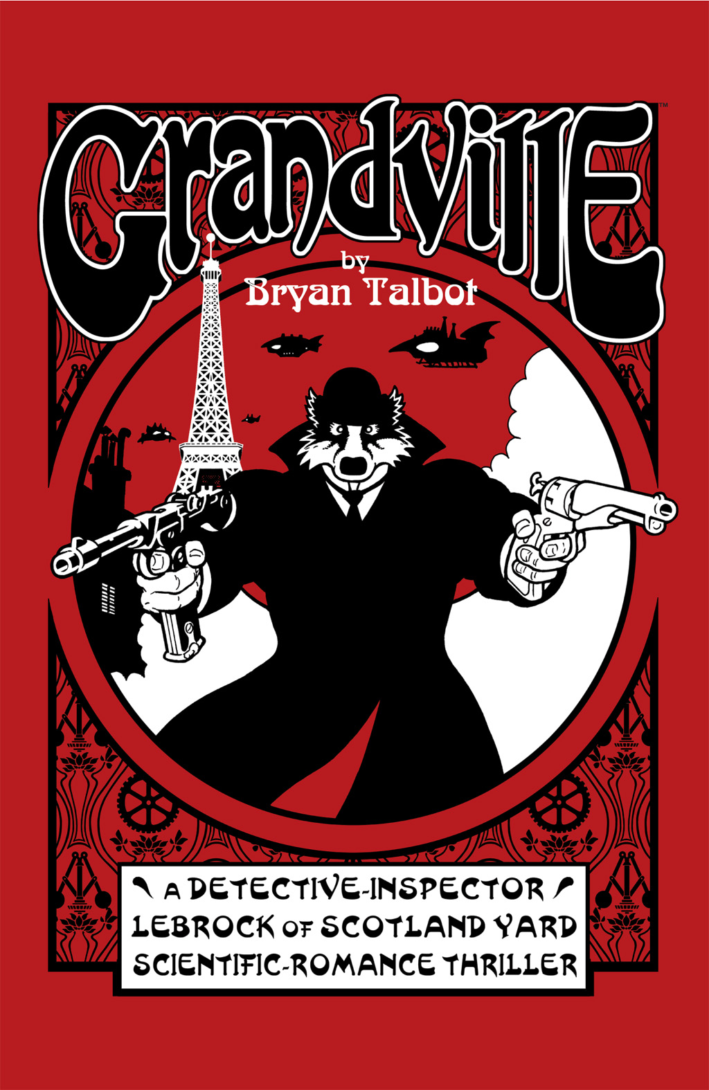
Bryan Talbot’s Grandville – An Appreciation

(OR an appreciation of Bryan Talbot’s Grandville series)

Recently I borrowed the Grandville series from my local library, I had a little inkling about the series after it was recommended to me by a friend, when I told him how much I enjoyed reading Blacksad and Maus. These stories had a world inhabited with anthropomorphic animals, that is, animals who had taken the role of humans. In the case of Blacksad, it was a deliciously dark, noirish tale about a private investigator who happens to be a black cat. He investigates everything from cold war espionage to racism, it was reminiscent of the best noir films such as Chinatown, and was nothing short of inspiring. Maus was centred around the experience of the Holocaust and its impacts on certain individuals (mainly the writer’s father) who lived through it all. The Jewish characters were depicted as Mice, and the Nazi’s were cats, and the Poles – pigs. It was an immersing read, harrowing, intriguing, horrorific yet uplifting and sometimes humourous too. The fact that the characters were depicted as animals did not detract from the overall enjoyment (if I can use that term) of these particular stories.

And so, I finally managed to read all three books (for now) in the Grandville series, and to say that I was blown away by them is an understatement!

They were an absolute joy to read.

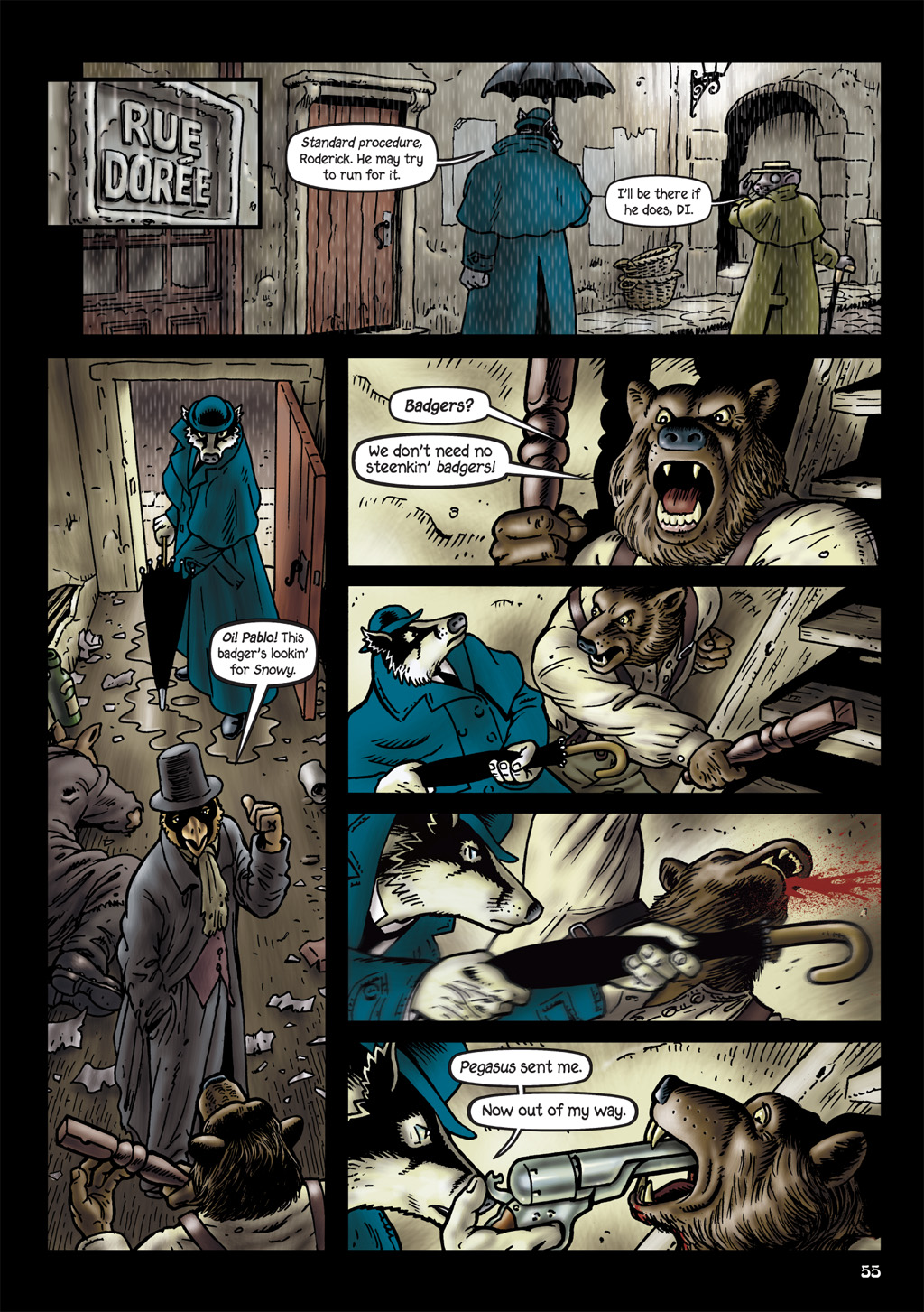
The main character is an anthropomorphic British badger; Detective Inspector Archibald “Archie” LeBrock of Scotland Yard, and his sidekick, Roderick Ratzi (who of course, resembles a rat). The partnership is more than reminscent of a certain Detective Holmes and his assistant, Dr.Watson. 

Roderick Ratzi

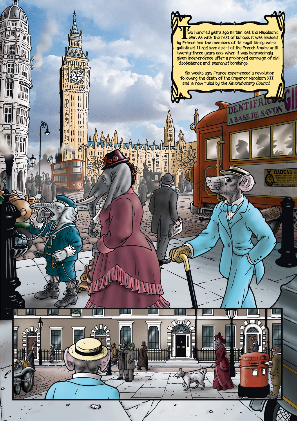
The story is a mixture of steampunk, alternative history with a dash of Quentin Tarantino and film noir thrown into the mix. It’s set in a world in which France won the Napoleonic Wars and invaded Britain, and in which the world is populated mostly by anthropomorphic animals.

The first book, entitled Grandville, sees LeBrock investigating a murder which leads him to visit “Grandville” (Paris) in order to solve the crime, which itself leads him to uncover a political conspiracy. Here he meets Sarah, a Badger whom he falls in love with. But there will be some tragic consequences, as those he is investigating want to silence him. It is important that the first book is engaging and spectacular, and Bryan Talbot passes with flying colours. Immediately the reader is taken into this intriguing world, where animals are the civilised ‘people’, whilst the people themselves, or ‘dough faces’ are seen as second class citizens. There’s a lot of other influences in Talbot’s creation which I will talk about later.

LeBrock’s love interest, Sarah

In the second volume, Grandville Mon Amour, LeBrock attempts to track down an escaped serial killer; Edward ‘Mad Dog’ Mastock, whom he previously brought to justice. There’s also a deeper conspiracy running through the goverment and those in authority which Detective Le Brock and Ratzi need to uncover. This is another enjoyable book full of excitement and intrigue. We also start learning more about our main character and his history.

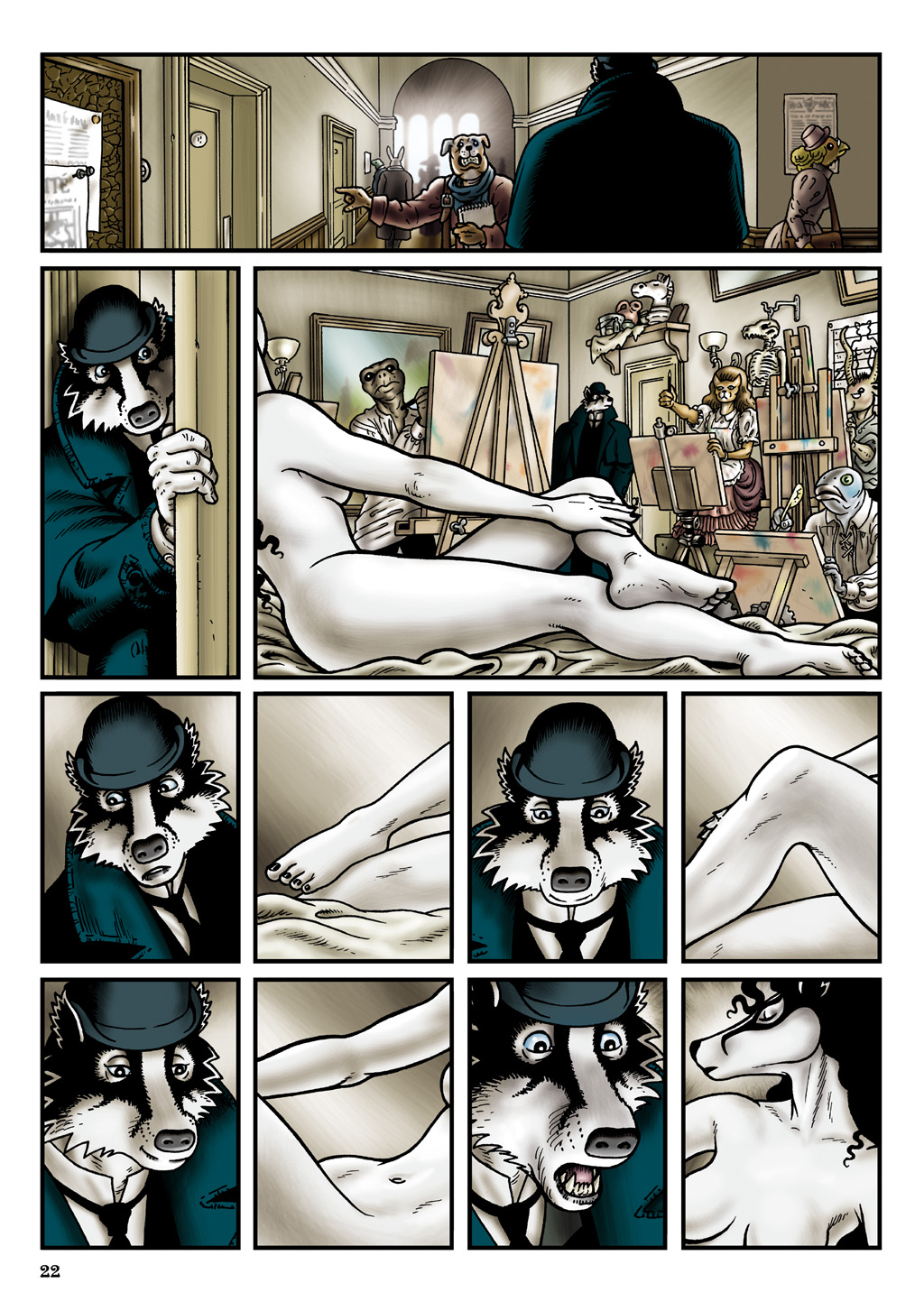
Grandville Bête Noire, the third volume, revolves around a sinister Toad (who more than resembles the famous Toad from the Wind in the Willows! He even resides in ‘Toad Hall’!). He, thanks to his legion of Automon (robot) creations, plans to overthrow the current French goverment and appoint himself as ruler. In the midst of all this, the ‘Dough faces’ have an uprising, no longer content with being second class citizens. And Detective Le Brock’s relationship with Billie gets more complicated. This is another fabulous addition to the series, there are so many talking points I cannot outline them all. However, two of the funniest moments involve Le Brock’s meeting with Professor Quimby (an obvious nod to ‘Q’ From the Bond films!), and Ratzi’s encounter with a bunch of drunk, out of work artists in a pub. Bryan Talbot’s artwork is simply exquisite, his mastery over both the script and the art is outstanding. Especially exciting is the way Bryan weaves the story along, the plot is really layered and full of surprises, not only for this book, but all three altogether.

One of the aspects I love about the series, is the sometimes topical political undertone running through the books. Some of the commentary is subtle, others maybe not as so. But I really enjoyed them. Also the use of English language, words such as “Bally” and “what?” and “Bugger”, helps to give the work a quintessentially British flavour. And of course, being British myself I absolutely loved their inclusion.

But perhaps the key reason why I enjoyed the stories so much, was the fact that growing up as a boy, I was a big fan of The Wind in the Willows and Rupert Bear (who gets a cameo in the first book). Bryan Talbot himself cites these creations as a major influence to his work not to mention French artist J.J Grandville, who’s anthropomorphic art were a big influence on Talbot’s work.

This is a superb series, I fell in love with it almost immeditately, it draws you into this alternate world filled with danger, mystery, romance and conspiracy, and by the end you don’t want to leave it. So it gladdens me to know that a fourth book entitled Grandville: Noël is planned for release this Christmas.

You can say that on this evidence, I cannot wait!

~~~~~~~~~~~~~~~~~~~~~~~~~

You can find out more about Grandville, and indeed its creator, Bryan Talbot, on his official website;

http://www.bryan-talbot.com/

2000AD PROG 1859 | REVIEW

2000AD PROG 1859 | REVIEW

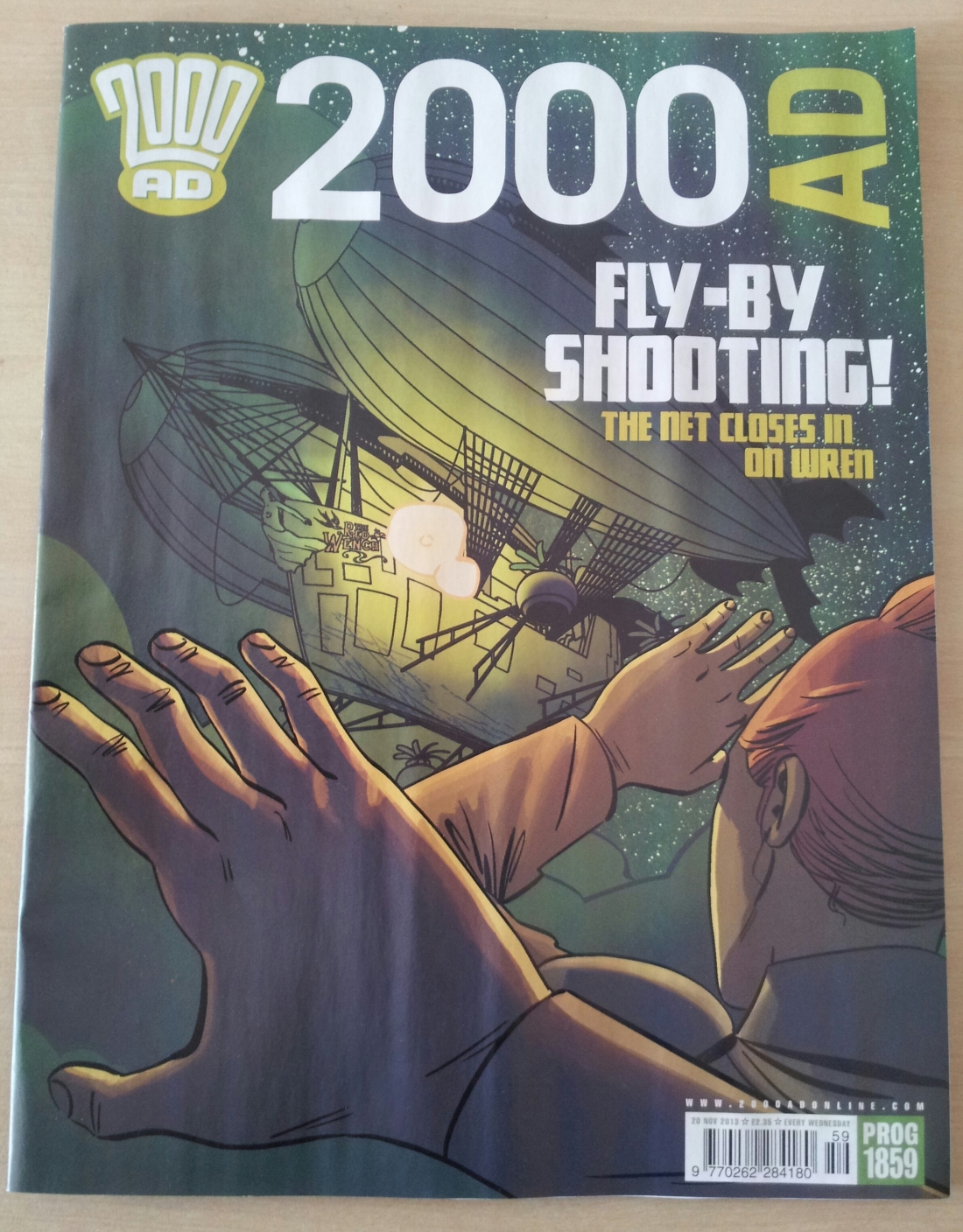
A nice P.O.V cover by Culbard. It’s something different which I like, the colour palette is also very nice, a sort of emerald hue with the dark blue sky and stars in the background.

Judge Dredd: Ferals (Part Two) was superb. Emma Beeby’s script is very engaging, with a interesting set up. Seeing the orphaned kids together reminded me of Charles Dickens and Enid Blyton’s novels to an extent. There’s a sense of mystery and adventure as the kids, aided by Old Stoney Face, try to uncover who the monsters are which are snatching the children away. I love the opening exchange between Dredd and the kids when he asks them for a description of the monsters, with each of them giving his or her own account. John Burns’ artwork is simply a joy to behold, with his painted panels interspersed with some line work, and colouring, especially for emphasis. He blends his style into the story with startling effect. Honestly, I spent a good amount of time just drooling over his beautiful artwork. I cannot wait to read the next episode.

Future Shocks: Home are the Heroes; a nice little Future Shock by A.J Buthcher accompanied by some lovely black and white artwork from Nick Dyer. The story concerns the homecoming of some soldiers after their victory over the aliens. A boy is worried whether the war would have changed his father, or whether he would recognise him. Soon he gets his father to tell him about the war. About the aliens. And pretty soon we have a twist at the end which if I am honest, I did see coming. But that was not the point, what mattered to me was the way the story was handled and rendered. There’s more to the story other than the twist, such as the good guys vs the bad guys, and the build up of dread especially when you see the reaction on the boy’s face.

Brass Sun: The Diamond Age (Part Ten); wow, ten episodes already and yet I feel like we’ve just scratched the surface. The world of Brass Sun and its clockwork solar system; the Orerry, looks so vast and rich I am sure Ian Edginton has far more surprises and interesting worlds up his sleeves for us. What of this particular episode then? Well I loved it! It felt really brief (which makes the wait for the next episode so agonising) but there were some important exchanges between the characters and some thrilling action too. We are still in the eerie confines of Hot Air, like a monolithic structure, cold and remote, that is until our three companions come under attack from the skies. Culbard’s panels are gorgeous. No other word for it. When Brass Sun is released in a collected trade, you can bet that I’d be first in line to grab myself a copy!

Flesh: Badlanders (Part Ten); oh dear. I’d been enjoying James McKay’s art for this new series, but in this episode his work looks really rushed. You can almost read the letters D-E-A-D-L-I-N-E between the ink strokes. Story-wise nothing much to report on, just Vegas Carver making a run for it, whilst McG sizes up Gorehead.

Damnation Station: The Howling Beast on the Borderline (Part Two); another action packed episode, although some of it is in Spanish. Plot wise I’m starting to find it a little muddy in places, and I’m not getting as excited as previous episodes. That said, some dazzling artwork again from Mark Harrison. The airlock scene in the final page in particular, was awesome.

So a satisfying prog overall, with Judge Dredd, Brass Sun and Future Shocks the standout for me.

My Recent Comic Purchases

My Recent Comic Purchases

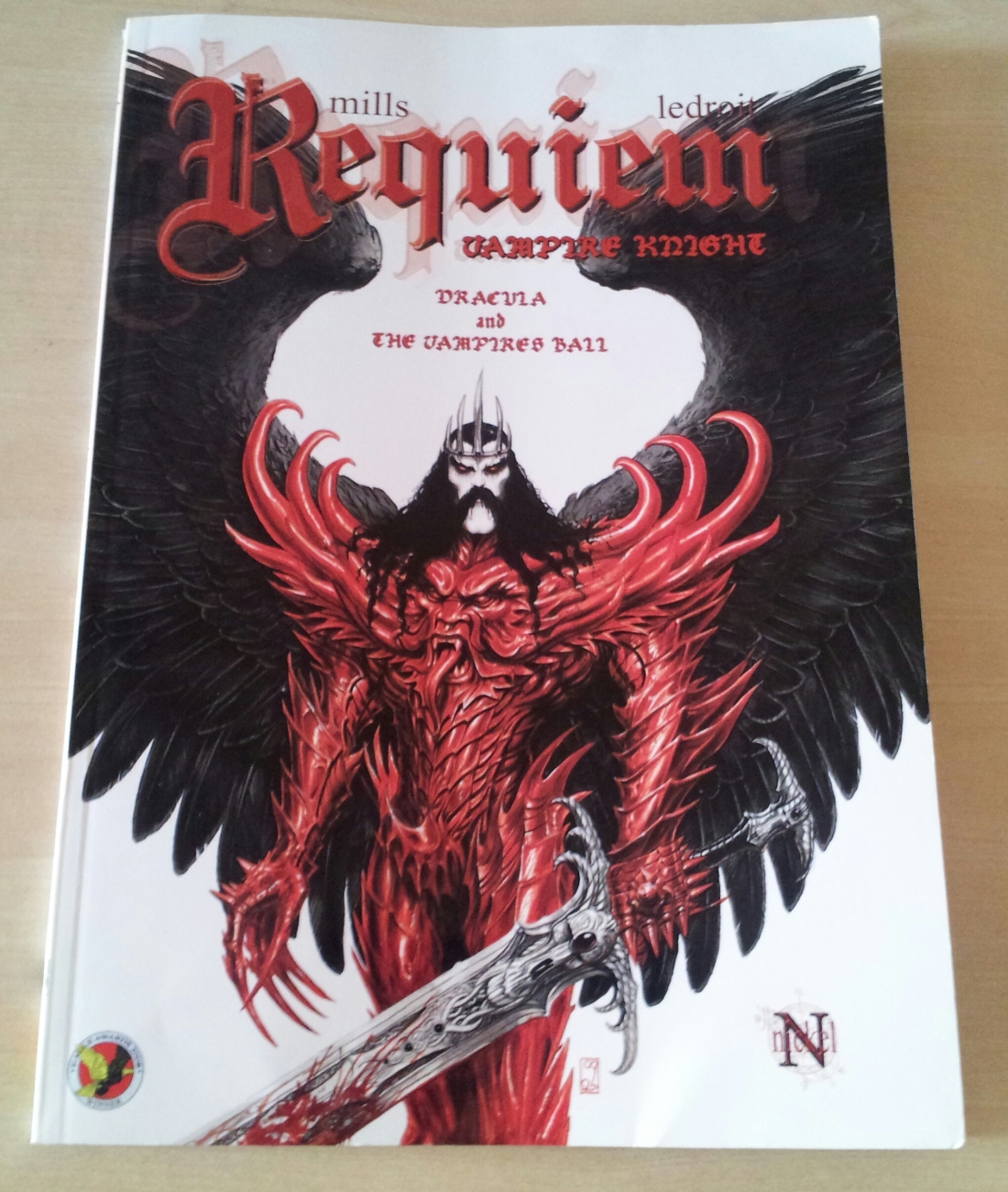
Requeim: Vampire Knight; Dracula and the Vampires Ball by Pat Mills & Olivier Ledroit.

French artists Ledroit’s artwork is so miraculously magnificent, it has to be seen to be believed. I first encountered his work in Sha (Heavy Metal Magazine Jan’ 1999) and fell in love with it straight away. Here his art is equally as good. There’s no denying Pat Mills’ skilled mastery over the storytelling medium, and both of them combined is a treat to savour!
20131121_153040
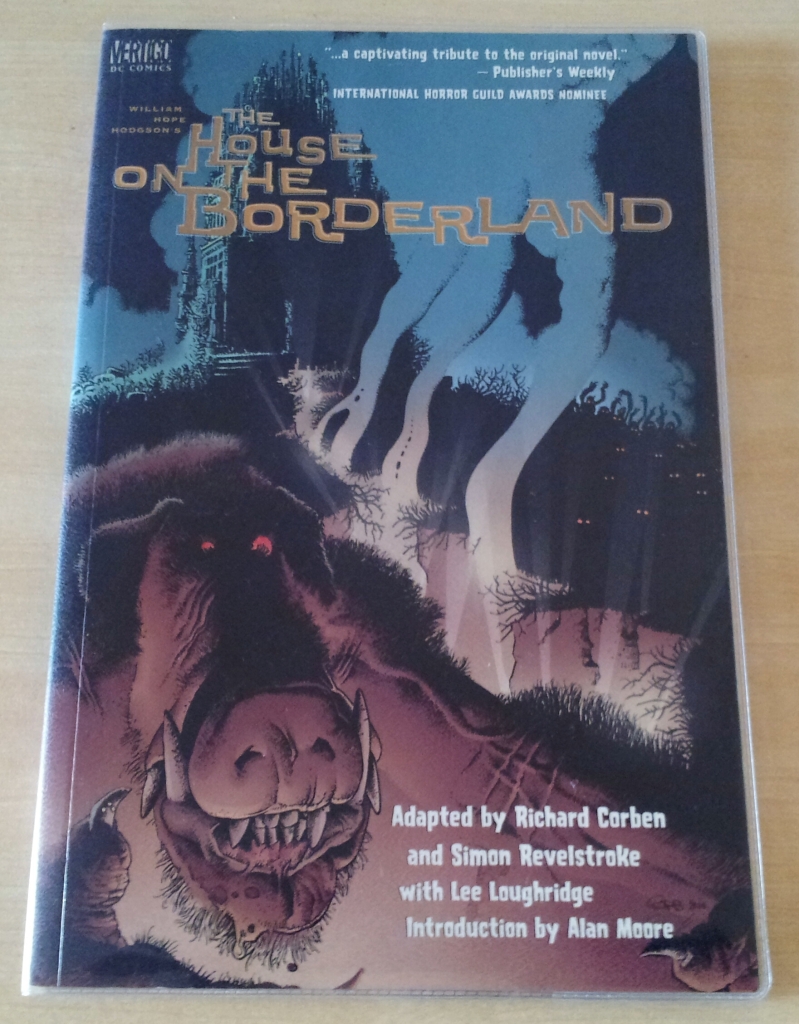
An equally formidable team are Richard Corben & Simon Revelstroke. I managed to obtain a copy of one of their best work; The House on the Borderland, which is an adaption of William Hope Hodgson’s highly respected horror novel. Mike Mignola cites this comic as his most favourite Corben work, and it isn’t hard to see why. There’s also a highly informative foreword by Alan Moore on Hodgson and his original novel.

2000AD PROG 1858 | REVIEW

2000AD PROG 1858 | REVIEW

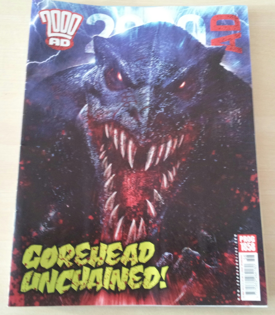
Another Gorehead cover, albeit less spectacular than Dave Kendall’s one. But when my five year old says it’s ‘awesome’ you can’t deny its effectiveness, although even he said it looked like a monster than a dinosaur. And I must agree, it is one of Langley’s better covers but Gorehead does look more demonic in look than dino-mic. (but maybe he’s supposed to look demonic, afterall his 666 stamp if not to signify the spawn of hell, then what else?)
Continue reading “2000AD PROG 1858 | REVIEW”

2000AD PROG 1857 | REVIEW

2000AD PROG 1857 | REVIEW

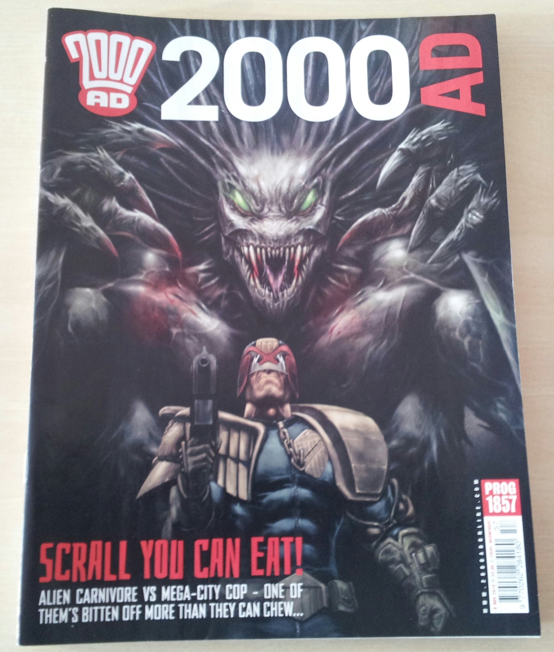
A very nice looking cover by Karl Richardson with the Scrall (the preadatory beast from the story) in the background with Dredd in the foreground, with his Lawgiver on the ready. I like it.
Continue reading “2000AD PROG 1857 | REVIEW”

2000AD PROG 1856 | REVIEW

Prog1856

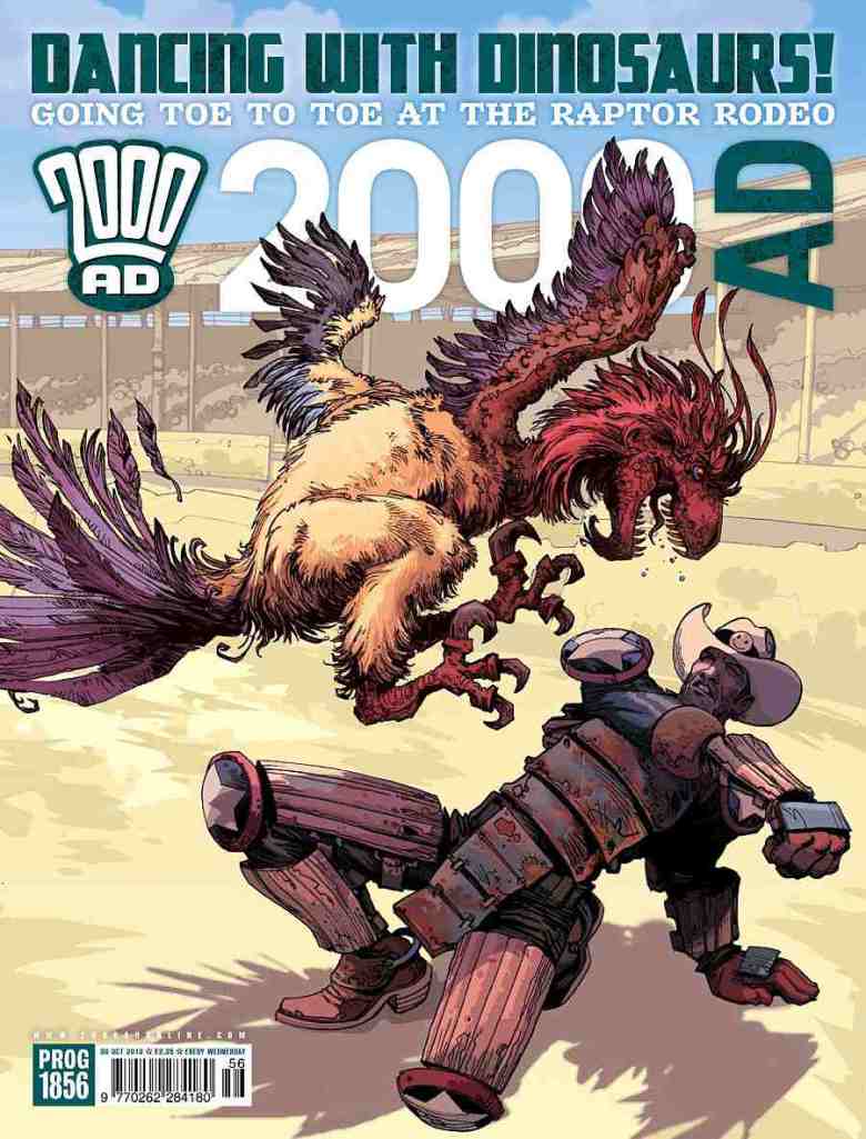
A nice cover by Carl Critchlow. It’s amazing to see how his style has evolved over the years to a point that his style is very distinctive today.

Judge Dredd: Prey (Part Two); another thrilling episode. This time the predator is unmasked, Dredd goes deeper into his investigation of the grizzly murders and there is a hint that there is more to Dr. Danes then we first realised. Again Karl Richardson’s artwork is amazing, I love his design of the upgraded Lawmaster on page two, his linework, details and colours are superb. Very much looking forward to the next episode.
Continue reading “2000AD PROG 1856 | REVIEW”

DEPT. OF MONSTEROLOGY #2 REVIEW

DEPT. OF MONSTEROLOGY #2 REVIEW

Writer: Gordon Rennie
Art: P.J Holden
Colours: Steven Denton
Letters: Jim Campbell
Publusher: Renegade Arts Entertainment

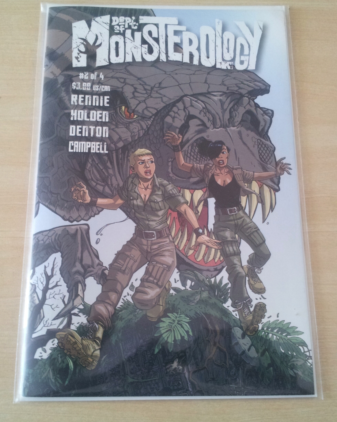
After moaning about the cover being too dark on #1, I’m pleased to say the cover for #2 is very eye-catching indeed! It’s a nice wrap around cover like the first one as we see Amelia and Emma running for their lives from a big-ass, hungry looking T-Rex.
Continue reading “DEPT. OF MONSTEROLOGY #2 REVIEW”

DEPT. OF MONSTEROLOGY #1 REVIEW

THE DEPT. OF MONSTEROLOGY #1 REVIEW

Script: Gordon Rennie
Art & Logo: P.J Holden
Colours: Steven Denton
Lettering & Production: Jim Campbell
Published by Renegade Arts Entertainment

I had known about the Dept. Of Monsterology for a while, but it was the prologue story published in the Meg (#341) which really got me excited. It looked marvellous; the standout no doubt was P.J Holden’s magnificent artwork. The double page splashes almost had me salivating, the colours by Steve Denton were deep and crisp. I was sold to the premise straight away, not to mention being a big fan of horror/ adventure comics.

Well what then do I make of this first issue (#1 of 4)?

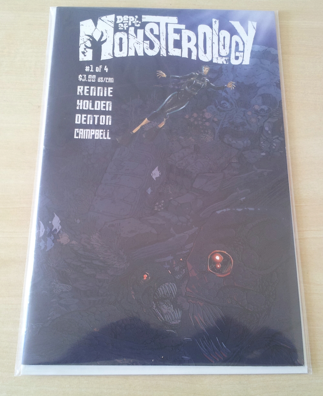
Well the cover for one, is a bit too dark. I know it’s supposed to depict the murky depths of the ocean with red eyed monsters at the bottom, but I could barely make them out. It’s a shame as it does a disservice to P.J’s art, in my view it could’ve been a bit lighter (I love the title design though). Other than that small quibble, Renegade have done a great job on the quality of the comic itself, with nice smooth papers which really brings the story alive (it smells bloody marvellous too!).

The interior art is mindbogglingly good. Even the shot of the monster strewn sea bed on Page 3 looks much clearer than the cover. The story opens with Team Challenger and their mission to investigate some strange goings on beneath the South Pacific Sea. It set up the characters really well, with each getting an introduction which I liked, from Amelia Court to Harry Wilmington – the professor with a cool mechanical suit, but we soon discover there’s more to him than we first realise. His character reminded me a little of Johann Kraus, the ectoplasmic agent in Mignola and Acrudi’s B.P.R.D series, but Harry is a whole different kettle of fish!

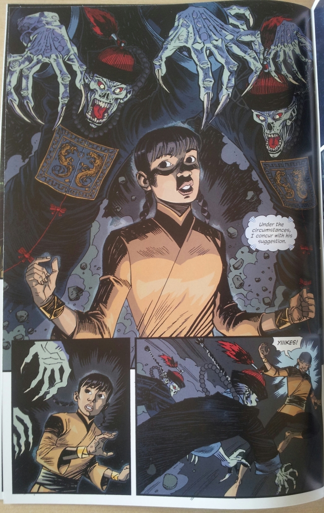
Halfway through the issue we drop in on Team Carnacki, I would’ve liked to have seen more from the preceding Team, but there’s a lot to get through with so little time. We follow Team Carnacki in a psychic investigation in Budapest as a young girl, Sawmi goes Astral Surfing, aided by her colleagues Dominic Belasco (a psychic) and Doctor Sonam. She comes up against a pair of Chinese Vampires, speaking of which, Holden’s art three pages later depicting our young protagonist surrounded by the demonic pair – is simply outstanding. Like the previous Team’s exploits, this was also an enjoyable read.

20131110_125736

Gordon Rennie’s script is really engaging, he has a great talent of creating vivid worlds and interesting characters which I find really appealing. His Absalom series is one of my favourite strips in 2000AD, and I really enjoyed Necronauts. And P.J Holden’s artwork just grows from strength to strength. Some of his work here is just dazzling to behold, Steve Denton’s colours add to it greatly. Like I mentioned prior for the prologue story, it’s really vibrant and crisp. And what would a great comic be without an equally great letterer? Jim Campbell does a cracking job here, I don’t know why we don’t see more of his work in 2000AD.

While reading this comic, although I did get a B.P.R.D vibe, I must say that the Dept. Of Monsterology felt like its own beast, with its own mythologies taking shape. This opening issue is really great as we learn about some of the characters and the world they inhabit, but it seems like this is but an icing on the cake. Already I’m feeling that this is going to be an exciting strip and I can’t wait to pick up #2.